Rgb 69,26,221 to Css #451ADD Color code html values
Css 451ADD Hex Color Code for rgb 69,26,221
Css Html color #451ADD Hex color conversions, schemes, palette, combination, mixer, to rgb 69,26,221 colour codes.
Div Background-color : #451ADD
.div{ background-color : #451ADD; }
html #451ADD color code
Text/Font color #451ADD
.text{ color : #451ADD; }
My text html color #451ADD hex color code
Border html color #451ADD hex color code
.border{ border:3px solid : #451ADD; }
My div border color
Outline hex color #451ADD
.outline{ outline:2px solid #451ADD; }
My text outline color #451ADD
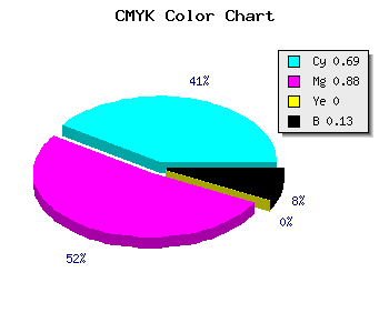
css #451ADD Color code html chart
|
|
css Text shadow : #451ADD color
.shadow{ text-shadow: 10px 10px 10px #451ADD; }
My text shadow
Css box shadow : #451ADD color code html
.box-shadow{ -moz-box-shadow::-30px 10px 10px #00000C; -webkit-box-shadow:-30px 10px 10px #00000C; box-shadow:-30px 10px 10px #00000C; background-color:#451ADD; }
My box shadow
Css Gradient html color #451ADD code
.gradient{ background-color:#451ADD; filter:progid:DXImageTransform.Microsoft.gradient(GradientType=0,startColorstr=#451ADD, endColorstr=#052afc);background-image:-moz-linear-gradient(180deg, #451ADD 0%, #00000C 100%); background-image:-webkit-linear-gradient(180deg, #451ADD 0%, #00000C 100%); background-image:-ms-linear-gradient(180deg, #451ADD 0%, #00000C 100%); background-image:linear-gradient(180deg, #451ADD 0%, #00000C 100%); background-image:-o-linear-gradient(180deg, #451ADD 0%, #00000C 100%); background-image:-webkit-gradient(linear, 60deg, color-stop(0%,#451ADD), color-stop(100%,#00000C));margin:0 0 50px 0; }
My div gradient html color
css rounded corner
.rounded-corner{ background-color:#451ADD; width:820px; height:70px; border-radius: 50px 50px 50px 50px;-moz-border-radius: 50px 50px 50px 50px;-webkit-border-radius: 50px 50px 50px 50px;border: 22px solid #00000C; }
My rounded corner div
css photo Image frame border
.image-frame{ border-style: solid; border-width: 27px 27px 27px 27px; -moz-border-image: url(http://www.cssbuttoncode.com/frame/border.png)27 27 27 27 repeat repeat; -webkit-border-image: url(http://www.cssbuttoncode.com/frame/border.png)27 27 27 27 repeat repeat; -o-border-image: url(http://www.cssbuttoncode.com/frame/border.png)27 27 27 27 repeat repeat; border-image: url(http://www.cssbuttoncode.com/frame/border.png)27 27 27 27 fill repeat repeat; }
My image frame border div
Css #451ADD Color code html values
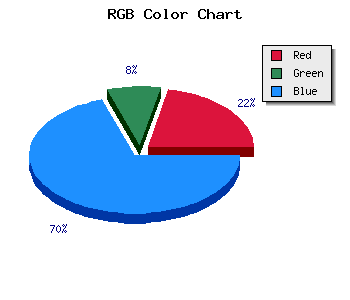
#451ADD hex color code has red green and blue "RGB color" in the proportion of 27.06% red, 10.2% green and 86.67% blue.
RGB percentage values corresponding to this are 69, 26, 221.
Html color #451ADD has 0% cyan, 0% magenta, 0% yellow and 34% black in CMYK color space and the corresponding CMYK values are 0,0,0, 0.
Web safe color #451ADD can display on browsers. Other information such as degree, lightness, saturation, monochrome, analogue,tint,shadow,luminosity,shades are shown below.
If you want to get monochrome, analogue, shades and tints, scrowl down the page, you will see tints, shades and luminosity saturation chart table below.
Css submit button html #451ADD color code
.buton{ -moz-box-shadow:inset 0px 1px 0px 0px #00000C; -moz-box-shadow: 0px 1px 3px 0px #00000C; -webkit-box-shadow:inset 0px 1px 0px 0px #00000C; -webkit-box-shadow:0px 1px 3px 0px #00000C; box-shadow:inset 0px 1px 1px 0px #00000C; box-shadow:0px 1px 1px 0px #00000C; background:-webkit-gradient( linear, left top, left bottom, color-stop(0.05, #66FF00), color-stop(1, #173B00) ); background:-moz-linear-gradient( center top, #66FF00 5%, #173B00 100% ); filter:progid:DXImageTransform.Microsoft.gradient(startColorstr='#66FF00', endColorstr='#173B00'); background-color:#66FF00; -moz-border-radius:15px; -webkit-border-radius:15px; border-radius:15px; border:4px solid #00000C; display:inline-block; color:#FFFFFF; font-family:Arial; font-size:32px; font-weight:bold; padding:4px 20px; text-decoration:none; text-shadow:1px 1px 0px #173B00; }.buton:hover { background:-webkit-gradient( linear, left top, left bottom, color-stop(0.05, #173B00), color-stop(1, #66FF00) ); background:-moz-linear-gradient( center top, #ce0100 5%, #66FF00 100% ); filter:progid:DXImageTransform.Microsoft.gradient(startColorstr='#173B00', endColorstr='#66FF00'); background-color:#173B00; }.buton:active { position:relative; top:1px; }
You can generate different button styles with our Css button generator .
Css image fade in
.fade { opacity: 1; transition: opacity .25s ease-in-out; -moz-transition: opacity .25s ease-in-out; -webkit-transition: opacity .25s ease-in-out; } .fade:hover { opacity: 0.5; }
Touch the image and it will fade in

Html #451ADD Hex Color Conversion
|
|
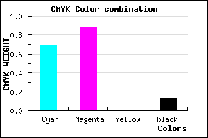
CMYK Css #451ADD Color code combination mixer
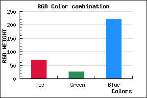
RGB Css #451ADD Color Code Combination Mixer
Css #451ADD Color Schemes
Css Background image
.background-image{ background-image:url("backimage.gif");}
Link Css #451ADD hex color
a{ color: #451ADD; }
css h1,h2,h3,h4,h5,h6 : #451ADD
h1,h2,h3,h4,h5,h6{ color: #451ADD;font-size:18px; }
My h1,h2,h3,h4,h5,h6 heading styles
Rgb Color code
Rgb Border color
Rgb background hex color
Rgb 69,26,221 Text color with hexadecimal code
Text font color is Rgb (69,26,221)
color css codes
Luminosity of css #451ADD hex color
- #070315 (459541) #070315
- #150844 (1378372) #150844
- #220d71 (2231665) #220d71
- #31139f (3216287) #31139f
- #3e18cc (4069580) #3e18cc
- #5831e7 (5779943) #5831e7
- #7c5eec (8150764) #7c5eec
- #a28df1 (10653169) #a28df1
- #c6b9f7 (13023735) #c6b9f7
- #ece8fc (15526140) #ece8fc
- lighter/Darker shades: Hex values:
- #451ADD (69,26,221) #451ADD
- #3301D8 (51,1,216) #3301D8
- #2100D3 (33,0,211) #2100D3
- #0F00CE (15,0,206) #0F00CE
- #0000C9 (0,0,201) #0000C9
- #0000C4 (0,0,196) #0000C4
- #0000BF (0,0,191) #0000BF
- #0000BA (0,0,186) #0000BA
- #0000B5 (0,0,181) #0000B5
- #0000B0 (0,0,176) #0000B0
- #0000AB (0,0,171) #0000AB
- #0000A6 (0,0,166) #0000A6
Color Shades of css #451ADD hex color
Tints of css #451ADD hex color
- Darker/lighter shades: Hex color values:
- #0000A6 (69,26,221) #0000A6
- #572CEF (87,44,239) #572CEF
- #693EFF (105,62,255) #693EFF
- #7B50FF (123,80,255) #7B50FF
- #8D62FF (141,98,255) #8D62FF
- #9F74FF (159,116,255) #9F74FF
- #B186FF (177,134,255) #B186FF
- #C398FF (195,152,255) #C398FF
- #D5AAFF (213,170,255) #D5AAFF
- #E7BCFF (231,188,255) #E7BCFF
- #F9CEFF (249,206,255) #F9CEFF
- #FFE0FF (255,224,255) #FFE0FF